Download high res pdf:
Tuesday, July 14, 2009
14.3 Cover: Layouts
First attempts at laying out a cover image with some photos taken at the studio. I would still like to try shooting the objects in various locations.


Monday, July 6, 2009
14.3 Cover: Work Session


Friday, July 3, 2009
14.3 Cover Plan
(Via email from Ren)
The plan for the cover:
RP 14.3 SPACE : CULTURE : PLACE
"the cover will be a photograph of small objects arranged in three groups. each group is differentiated by colour. the three colours represent the three main conceptual components of this issue's theme; space : culture : place.
with regard to understanding/representing "culture" the tripartite relationship of space : culture : place can be understood as a ratio. this is why the three components are represented with a colon dividing them.
since this publication is composed of written work about culture, each composition can thus be measured according to the ratio, albeit subjectively. for example, jim's article about d'arcy island can be thought of as; 25 parts space : 25 parts culture : 50 parts place
for this we will need editorial* help.
these ratios can be visualized according to a pie chart. they can also be visualized according to the specific objects that we've chosen to represent each article. for example, a model of a small island might be used for jim's article. a chrysanthimum for fiona and ray's Q&A. a quill pen with a daggar for a tip for ginger's personalized historical almanac. etc. (note: three objects per article will be chosen, giving us a diversity of little objects combined in a well-textured visual).
all of these small objects will be assembled and photographed in an aesthetically appropriate environment. each object will be labelled with a place name in canada; a distribution city.
--
each object will be mailed to our distribution locations across canada, and hidden and/or safely kept there. our readers will be encouraged to find each object in an open call -- indicated on the front or back cover.
we will need to contact people in each location in order to effect this. we will use our personal contacts, and are hoping to use the wider list of subscribers and/or distributors.
for this part, we'll need administrative** help.
the person hiding each object will give us the exact location. we hope to have these objects "kept at the desk" at certain institutions like libraries or museums that relate to the articles, or to be placed in areas of mixed-heritage. the reason for this is to encourage our readers to use the cover, and the issue, as a means to discover the place around them.
each object is a "prize" in itself, but each object will also have an objective for the seeker/finder/winner. for instance; one might be a free subscription. another might be an invitation to use the object in an artwork or story to be used in the next issue. one might be a fortune; "you're a loser because you live in manitoba". the point is to create a kind of relationship with a person out there, perhaps as a way of fishing for contributors and supporters.
----------------
notes:
*we are hoping to get our writers to give a subjective ratio measurement of their writing. can each writer/contributor be asked to provide this very subjective measurement? the reason why we'd like to do this is twofold:
1) we are going to use this measurement as a way to create dialogue with our readers about each article. ideally, writers and readers, and readers and readers can exchange their ideas about the ratios and topics on the ricepaper blog. we are assuming that our writers are willing to blog about what they've written in print. if this assumption is not correct, no big deal. they needn't blog at all. but at least, can they provide a ratio, because;
2) we plan to use this measurement as a means to create a navigational structure within the magazine pages, such that a reader can view what element of culture they want to read about by looking at it's visual representation as a pie chart ratio.
**feasibility, contacts, ideas are needed."
Wednesday, July 1, 2009


Tuesday, June 30, 2009
Cover Ideas
Hey all,
Some pretty good references for the cover ideas, especially related to performance/installation pieces:
http://feistytangerine.com/
Look for "Kids & AIDS."
Some paper diagrams & charts:
Daily Consultation (in %)
Some pretty good references for the cover ideas, especially related to performance/installation pieces:
http://feistytangerine.com/
Look for "Kids & AIDS."
Some paper diagrams & charts:
Daily Consultation (in %)
Wednesday, June 24, 2009
Cover Inspiration: Takashi Iwasaki
Recommendation from Alex!
http://takashiiwasaki.info/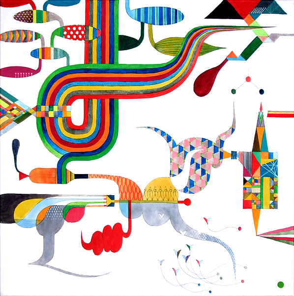
http://takashiiwasaki.info/
Gemmidakosasanouzu, Acrylic on canvas, 51 x 51cm, 2008
Cover Inspiration: Hye-Seung Jung
Whimsical work by a Calgary-based artist featured in the group show Memory and Place at A Space Gallery in Toronto and at Trap\Door ARC in Lethbridge.
http://www.aspacegallery.org/index.php?m=programdetails&id=72
http://www.aspacegallery.org/index.php?m=programdetails&id=72
Chebudong Project 1, Pencil drawings, shelves, strings, map, dimensions variable, 2008

14.3 Cover: Brainstorming Session
Broader Concepts
Thoughts on design processes, how Ricepaper can evolve, etc.


Brainstormed the use of unifying aesthetic elements that would add another layer of engagement to the writing and artwork, ex: ratios, gradients. 


Magazine & 14.3 Issue Concepts


14.3 Cover Concepts
Possible ways to increase interactivity by enabling the reader to manipulate and reinterpret the content on the cover.


Friday, June 12, 2009
Ricepaper Art Team Blog
The name sounds it can fight crime.
And so, I guess here's where we put shit up and discuss, to carry on from previous meetings.
A gentle recap of yesterday, in bullet points because I know Rennard is working on a summary:
And so, I guess here's where we put shit up and discuss, to carry on from previous meetings.
A gentle recap of yesterday, in bullet points because I know Rennard is working on a summary:
- Where is RP now? Where do we want this to go?
- What is the role of a magazine today? What is it for?
- (Which led to) a lengthy discussion of (arghh) print vs. web, or print in conjunction with web
- Ideas for the cover
- Keywords: charts, diagrams, binaries, tertiaries
- New generation of confused Asian halfies/immigrant kids
- A tertiary relationship between media, as opposed to the traditional binary and insular relationship (expectation of immediate response once something is offered publicly)
Subscribe to:
Posts (Atom)